


Before moving into training and coaching, I was an IT Consulting Engineer for 25-plus years. To this day, I have a left-brain bent. But I remember the experience that changed my perspective on what makes a powerful technical communicator (hint: it involves both hemispheres).
I was watching a very senior engineer at Cisco give a technical presentation. This engineer was so senior and well-regarded, he held a prestigious Fellow position at the high-tech company.
What struck me was that he was so good at illustrating his points and keeping the audience rapt. I approached him after his talk and asked him, ‘What’s your secret sauce?’ He said, ‘Whenever I give a technical talk, I start by explaining in a way that my mum would understand it.’
I really liked the way he dove into deep technical detail only after he introduced the concepts with brief, compelling stories and vivid analogies. To me, that was a perfect way to make sure everyone understands what you’re talking about, without dumbing down the content.
What I’ve learned since then is that this kind of approach to technical presenting doesn’t take away from the content expert’s credibility; as a matter of fact, it adds to it, especially if they’re addressing a mixed audience.
Delivering clear, complex data in a meaningful way to the people and businesses impacted is more important than ever—at work and in our communities.
To do it well, you might need to rethink some of the hallmark left-brain preconceptions about how to craft and deliver your talk. But trust me, it’s well worth the journey.
Here are our top pointers . . .
1. Start With Your Audience in Mind
Who are you presenting to, and how is your main message or proposal relevant to them? How much detail do they really want or need? Your technical peers might be happy to dive into lots of detailed data. But how about a mixed audience of engineers, salespeople, and potential customers? Or maybe senior executives, who just want the bottom line?
For example, let’s say you’re presenting to a mixed audience. The best strategy would be to organize your presentation so you begin with a big-picture overview and main message/proposal for the non-technical people; then a strategic level of detail for technical managers and technical specialists outside your area; and last, a deep dive for content experts who are familiar with your work.
We think of it as an inverted pyramid of content detail . . .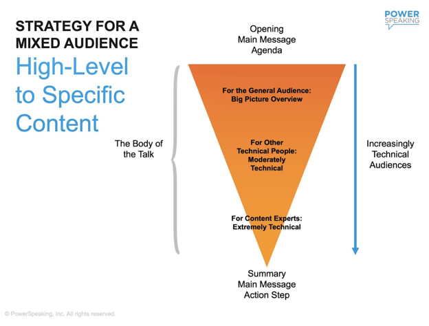
-
Senior-level executives prefer content focused on the overall impact of your data or proposal: the cost, ROI, and benefits. They want the high-level view, with executive summaries, solutions, and future business implications. (Check out our downloadable PDF, “How to Present to Executives: 23 Proven Tips”)
-
Non-technical audiences and technical people in different disciplines also appreciate higher-level content. In addition, they typically want to know how what you’re presenting will affect them directly. Will it impact their workload or priorities? Will it delay other projects they’re working on? Will it shift roles or responsibilities?
-
Technical audiences want content rich in detailed data analysis, design specifications, theory, and statistics. They expect you to know the jargon and to use technical terms. They want to know about the research behind your data, and they appreciate information such as algorithms, process-flow diagrams, feature lists, and coding examples.
One presenter we worked with noted that with mixed audiences, he starts by announcing, "Today, I'll be doing a split-level presentation. The first 10 minutes will be a big-picture, market-focused summary. In the next 10 minutes, I will provide an overview of the technology involved. In the last 10 minutes I will go into the detail and present the results of our code review. Feel free to leave before the next level of detail if that is not what you want."
So remember, consider your audience before you get too far in crafting your presentation. By doing so, you will be more . . .
Engaging
By directing your presentation to the audience’s needs, you’ll increase attention and retention.
Efficient
By creating an audience-centric presentation from the start, you’ll find it easier to plan and deliver a relevant and memorable talk.
Effective
By communicating an action the audience can take as a result of the presentation, you’ll have a greater impact (we go into this in “Identify an Action Step,” below).
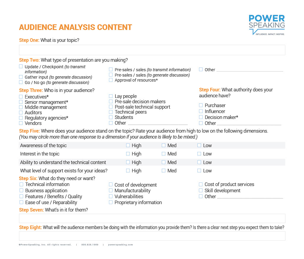
Here’s a helpful Audience Analysis checklist we developed for workshop participants.
Next, what do you want the audience to do with the data you’re presenting?
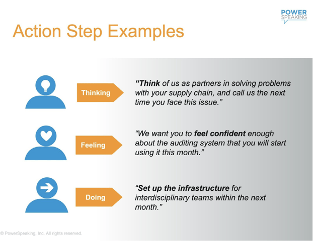
2. Identify an Action Step
Once you’ve analyzed your audience, the next best step is to ask yourself, "What do I want the audience to do, think, or feel as a result of hearing this presentation?"
One common mistake many presenters make is to assume the audience understands what they’re being asked to do. Unless your request is clear and concrete, you risk creating confusion and losing their support.
Here are some quick examples of effective vs. ineffective action steps . . .
Again, it helps if you think in terms of what you want your audience to think, feel, or do . . .
Now it’s time to dive into the core content of your presentation . . .
3. Develop a Clear Main Message
Even if you have complex ideas or data to discuss, your presentation should have a clearly stated central purpose or key message. Why are you presenting the data? What do you want your audience to remember?
A short, clear, and compelling main message accomplishes several important things . . .
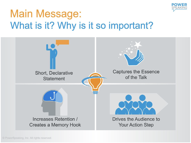
Here are some best practices for developing your main message so it’s clear and memorable . . .
As PowerSpeaking, Inc. Master Facilitator Rita Williams emphasized in the video, repetition of your main message—word for word—is key. Research has shown that people are much more likely to retain your clear, concise main message if you repeat it at least three times throughout your presentation, at the beginning, middle, and end.
Once you’ve analyzed your audience, identified an action step, and crafted your main message, it’s time to turn to the substance of your presentation . . .
4. Make Your Content Relatable and Memorable
Your data alone might be endlessly fascinating to you and your technical peers. But if you’re giving a presentation or talk, you probably have a larger purpose and a broader audience to reach.
Maybe you want to get a group of teams fired up about the next phase of product development. Perhaps you need to enlist support from other departments to make a system change. Or maybe your team needs budget approval from senior management to launch a new project.
No matter your purpose, you’re far more likely to succeed if you help your audience relate to your content and remember (and maybe act on) it after the presentation is over.
We’ve found that the best way to do that is to craft a technical presentation that balances analytical and anecdotal evidence—and connects with people on a human level.
Analytical Evidence: Facts and Figures
Analytical evidence is typically evidence drawn from statistical information—especially data collected by systematic methods. For example, the number of component failures reported in a quarter, the percentage of people who had adverse reactions to a new drug, or the ROI on a new service offering over a specified period of time would all be considered analytical data.
Anecdotal Evidence: Stories, Analogies, Case Studies, Examples
Anecdotal evidence tells a story rather than drawing solely on numbers or percentages. Examples: A story about how a seriously ill patient responded to a new drug, reading a letter from a satisfied customer, or talking about an experience you had when calling your own company for customer service.
Some technical people in our workshops bristle at the idea of storytelling or, as they’ll say, “trying to be entertaining.” But being an entertainer isn’t the point here. The point is that we’re all human, and images, metaphors, and stories spark our interest and lodge in our memories more easily than facts and figures alone.
Case in point: This powerfully vivid analogy from scientist and author Carl Sagan:
“In fact, the thickness of the Earth's atmosphere, compared with the size of the Earth, is in about the same ratio as the thickness of a coat of shellac on a schoolroom globe is to the diameter of the globe. That's the air that nurtures us and almost all other life on Earth, that protects us from deadly ultraviolet light from the sun, that through the greenhouse effect brings the surface temperature above the freezing point.”
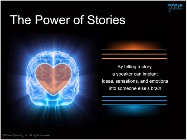
In his book “Actual Minds, Possible Worlds,” psychologist Jerome Bruner estimated that facts are about 22 times more memorable when they are delivered via a story.
When the brain sees or hears a story, it mimics the pattern of the writer’s or speaker's brain. This is known as neural coupling, where in effect, the storyteller literally shares their sensory experience with another person. (A much more memorable experience than looking at a spreadsheet in a slide presentation.)
“You cannot reach a person's head without first touching their heart, and the path to the heart runs through the brain, starting with the amygdala . . . We now know which brain chemicals make us pay attention to a speaker (cortisol) and which make us feel empathy toward another person (oxytocin)." — Carmine Gallo, "Storyteller's Secret.”
Many times, a simple analogy is an effective way to make a complex issue clear and relatable. One of my PowerSpeaking colleagues, Master Facilitator and Coach John Warren, told me, “I still remember a vivid analogy used by a HighTechSpeaking® workshop participant decades ago. She said, ‘You can’t play tennis with a bowling ball,’ then went on to explain, ‘The old system was too big and complex. The new one is smaller and faster.’”
“You can’t play tennis with a bowling ball.”
So, remember that research proves you will increase the impact of your data and your message by reaching people through their hearts and minds.
Next, use the power of imagery to help people understand and remember key points . . .
5. Be Creative With Visual Aids
Whether you’re presenting in person or virtually, there are several ways you can hold people’s interest and drive home your message by getting creative with visuals.
Add Imagery to Explain Data
You already know not to clobber your audience with endless data-dense slides, right? Good. The more you can convey data/key messages via imagery, the more engaging and memorable your content will be.
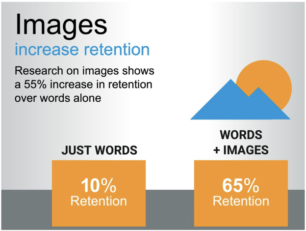
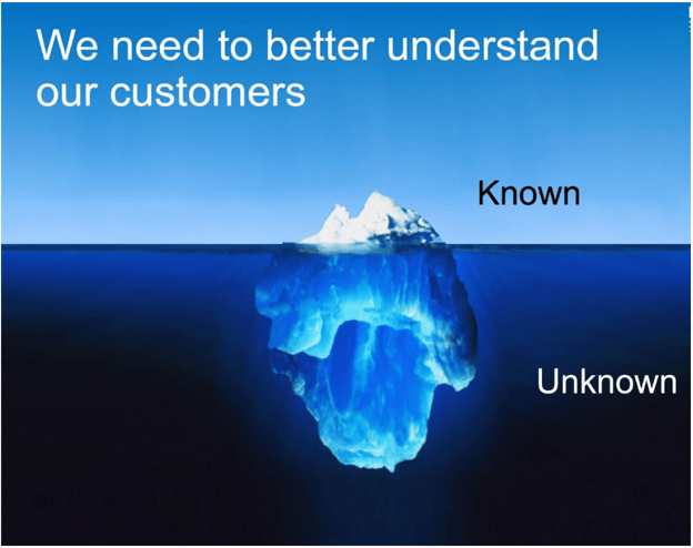
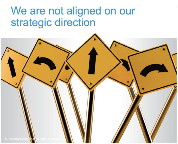
Here are a few more examples of combining simple, powerful images with (few) words to deliver a message . . .
Don’t Limit Yourself to Slides
Think about introducing a variety of visual aids to make your presentation more interesting . . .
Whiteboards: A virtual whiteboard or an in-person flip-chart are still great ways to emphasize key points, capture audience feedback or questions, or explain a concept.
Props: Use props to illustrate a key metaphor or idea from your presentation. A world globe could help illustrate the global marketplace, or an apple could evoke preventive health care (“An apple a day keeps the doctor away.”)
Handouts: A handout allows the audience to take something back to work that can be used as a reference or summary of your content.
Video Clips: These are a great way to break the monotony of still slides, and often introduce a more human factor to the topic.
6. Use Pattern Disruption to Hold Attention
There’s nothing like breaking a pattern to snap people back to attention. Think of a presenter who suddenly turns off the screen or introduces music. Or how about a presenter who’s been talking for five minutes then suddenly . . . stops. Silence, for like 30 seconds. You’d look up, right?
Consider places in your presentation where people might need something fresh to keep them engaged. Some examples . . .
- Stories and analogies
- Questions
- Video clips or sound recordings
- Style changes (vocal, movement, gestures, pausing)
- Blanking the screen
- Visuals (graphics, illustrations, images)
- Audience participation (small group discussion, brainstorming)
Next, let’s look at one aspect of successful presenting that causes many techies to roll their eyes: an engaging delivery style.
Stay with me. It’s relatively painless . . .
7. Don't Underestimate the Power of Style
A speaker who stands statue-still, stares at their slides or notes, and speaks in a monotone is enough to put anyone to sleep—no matter how interesting the content.
Remember, even scientists, engineers, and system programmers are human. And research has shown that we humans are moved by nonverbal communication. We “read” a lot into its presence or absence, which means it can either obscure or make clear what we’re saying out loud.
“What you do speaks so loudly that
I cannot hear what you say." —Ralph Waldo Emerson
If you’re preparing to make a presentation or give a talk, it’s likely you do what most people do: focus solely on your content. While what you have to say is definitely key, how you say it—through nonverbal “language”—is a lot more important than you might think.
Research has shown repeatedly that your posture, gestures, facial expressions, and the tone and cadence of your voice play a huge role not only in getting your message across to an audience, but also, in engaging them, building trust, and increasing your credibility.
Your tone of voice, for example, has a big impact on how your content is received.
Not being able to hear a speaker, either because of poor audio or a too-soft voice, isn’t just an annoyance. In a USC study that looked at the effects of poor audio in scientific presentations, they found that, “When the video was difficult to hear, viewers thought the talk was worse, the speaker less intelligent and less likable, and the research less important.”
Speaking in a dreary monotone is another way to lose your audience. Watch how to avoid it and instead, create energy and interest . . .
source: Great Speech Writing, "How to Avoid Speaking in a Monotone," via YouTube
If you’d like more tips on making nonverbal communication work for you, check out our blog, “Use the Power of Nonverbal Communication to Connect with Your Audience: 7 Tips.”
8. Bring Your Authentic Self to the Table
Sau Lan Wu, renowned particle physicist
Speaking of the human factor when it comes to presentations, know that authenticity, openness, and passion go a long way in engaging your audience, building trust—and yes, even establishing your credibility.
NASA mathematician Katherine Johnson once revealed her childhood passion for numbers in a very simple, relatable way . . .
“I counted everything. I counted the steps to the road, the steps up to church, the number of dishes and silverware I washed ... anything that could be counted, I did.”
Now, if you had been in the audience when she led with that, she’d have your attention, right?
No matter how complex the data or the message, an audience-centric, authentic, human approach is a good place to start.
Join Us in Conversation . . .
Thursday, August 20, 2026, 9:00-10:00 a.m. PT; 12:00-1:00 p.m. ET; 5:00-6:00 p.m. BST


.png?width=270&height=360&name=PS%20Live%20Blog%20Sidebar%20CTA%20(27).png)
